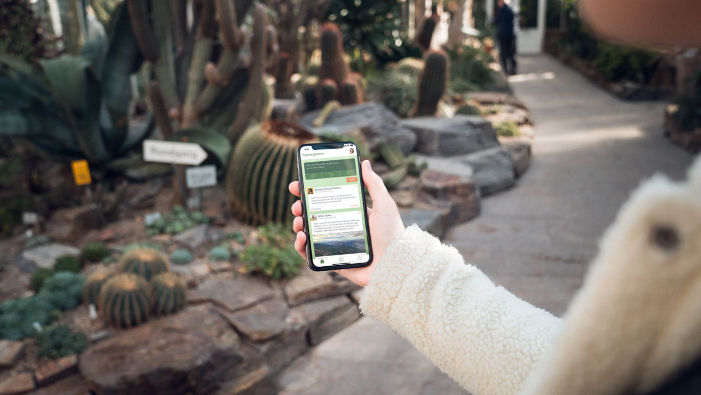
I created this project as part of General Assembly's UX Design bootcamp. I completed the entire UX research and design process over 10 weeks to create this app dedicated to creating a community of people interested in living sustainably. Below is the case study of the product.
Background & Initial Research
Climate change is one of the most dangerous issues of our lifetime. The problem with Climate Change, though, is that it is a huge, global problem. What can I do, as an individual? How much impact am I really having on the environment? How do I live each day, thinking about my impact without becoming a ball of doom and gloom anxiety?
These questions are often at the forefront of my mind and are what spurred me to look into a solution. I didn't have an exact idea in mind when I conducted my research. This allowed me to be open to listening to what users needed in a solution.
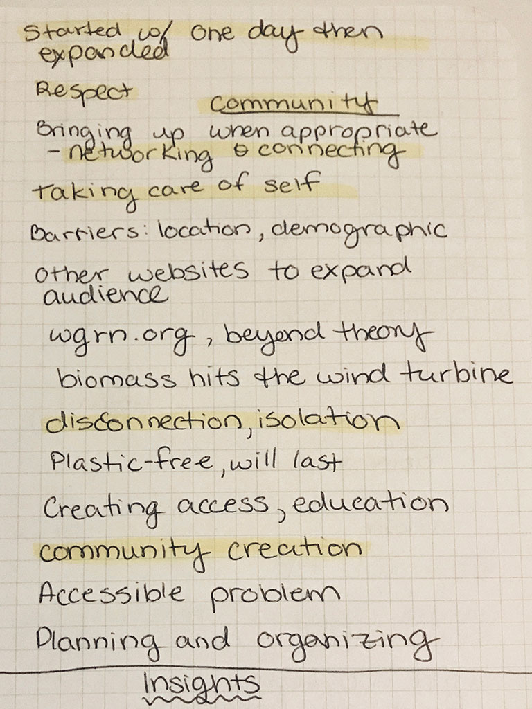
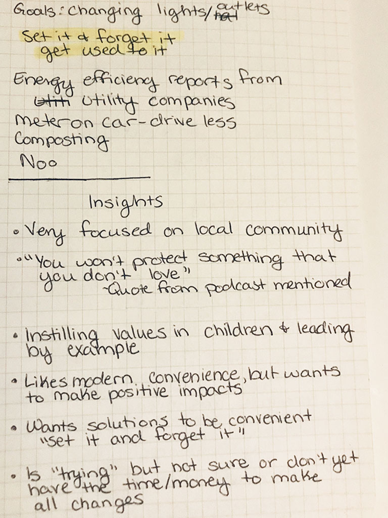
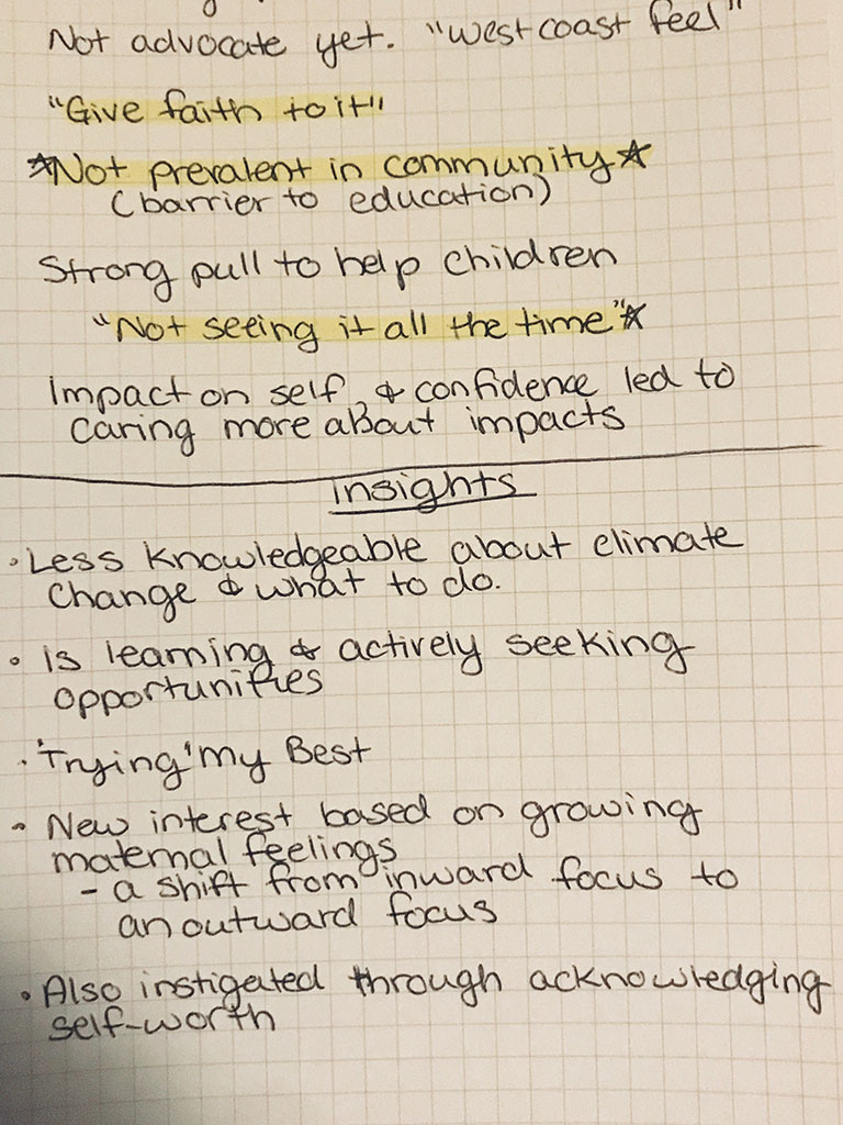
For my interviews, I talked to the “average” person. People who were in the process of making lifestyle changes, and had some knowledge about climate change and what they could do, but didn’t know everything.
I interviewed four individuals questions about what they already knew about climate change and its affects, where they find information on the topic, what they already do to mitigate their impact, and how they know their efforts are working.
What I discovered was that while these individuals had different motivators for being eco-conscious, they were all very concerned about climate change. Without my prompting, all four interviewees brought up community, citing that they wanted to know more about how climate change would affect their area, and that they wanted to be connected to others like them. So, I knew that my solution would have to address this issue of community and locality.
I also found that each person had an outside motivator that pushed them towards sustainability. These motivators ranged from having or wanting children to health concerns to spiritual growth. This seemed to be a key factor for making changes to their lifestyle..
This outward focus would become their motivation for utilizing my solution.
Analysis and Solution Development
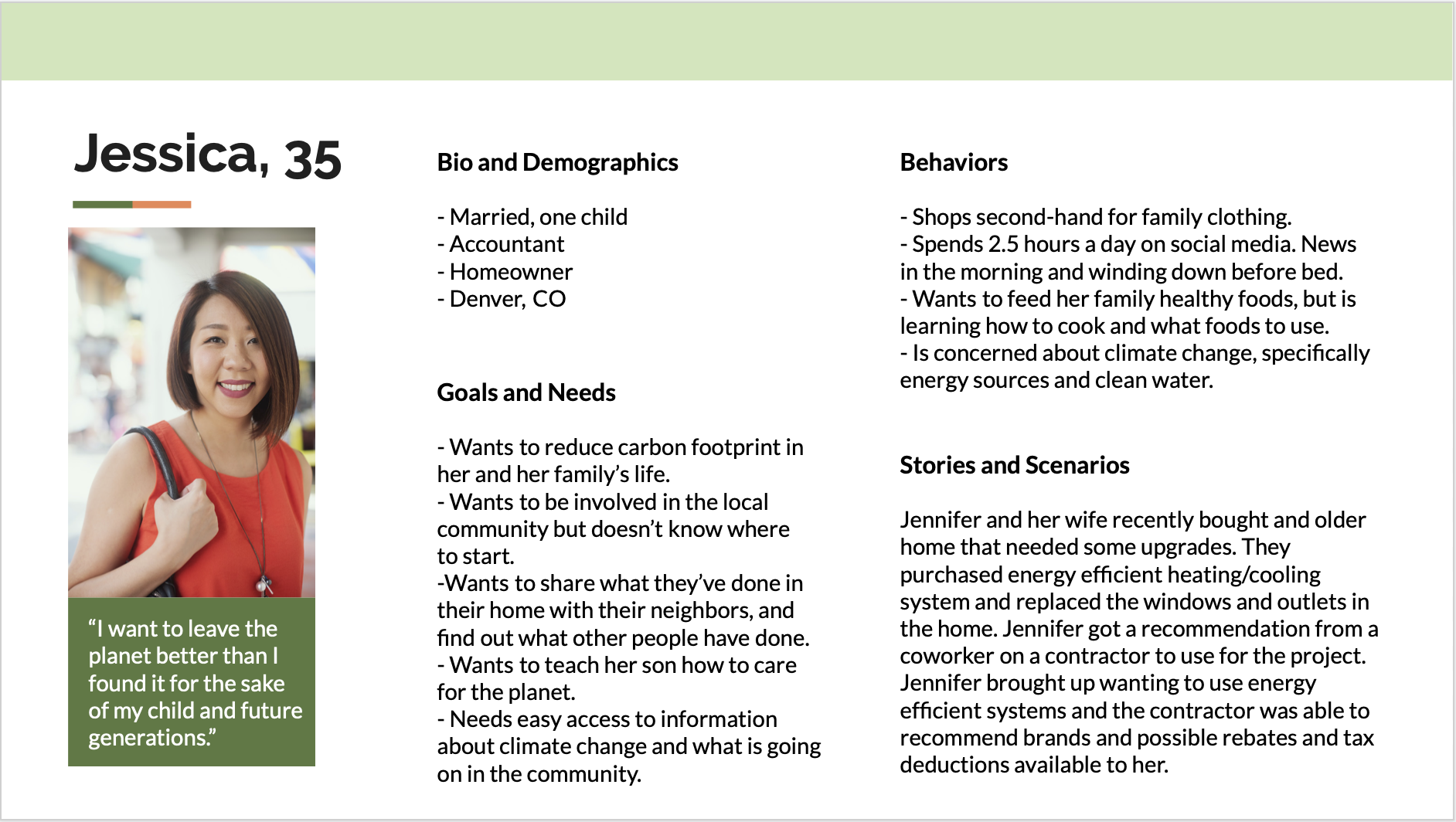
After working through an affinity mapping exercise, I utilized my interview findings to create a persona. By pulling scenarios, motivations, and other info directly from my interviews, I could assure that my solution was geared towards my users. I chose this age range as I knew that my users would need to be financially able to make lifestyle changes and have the lifestyle flexibility for it.
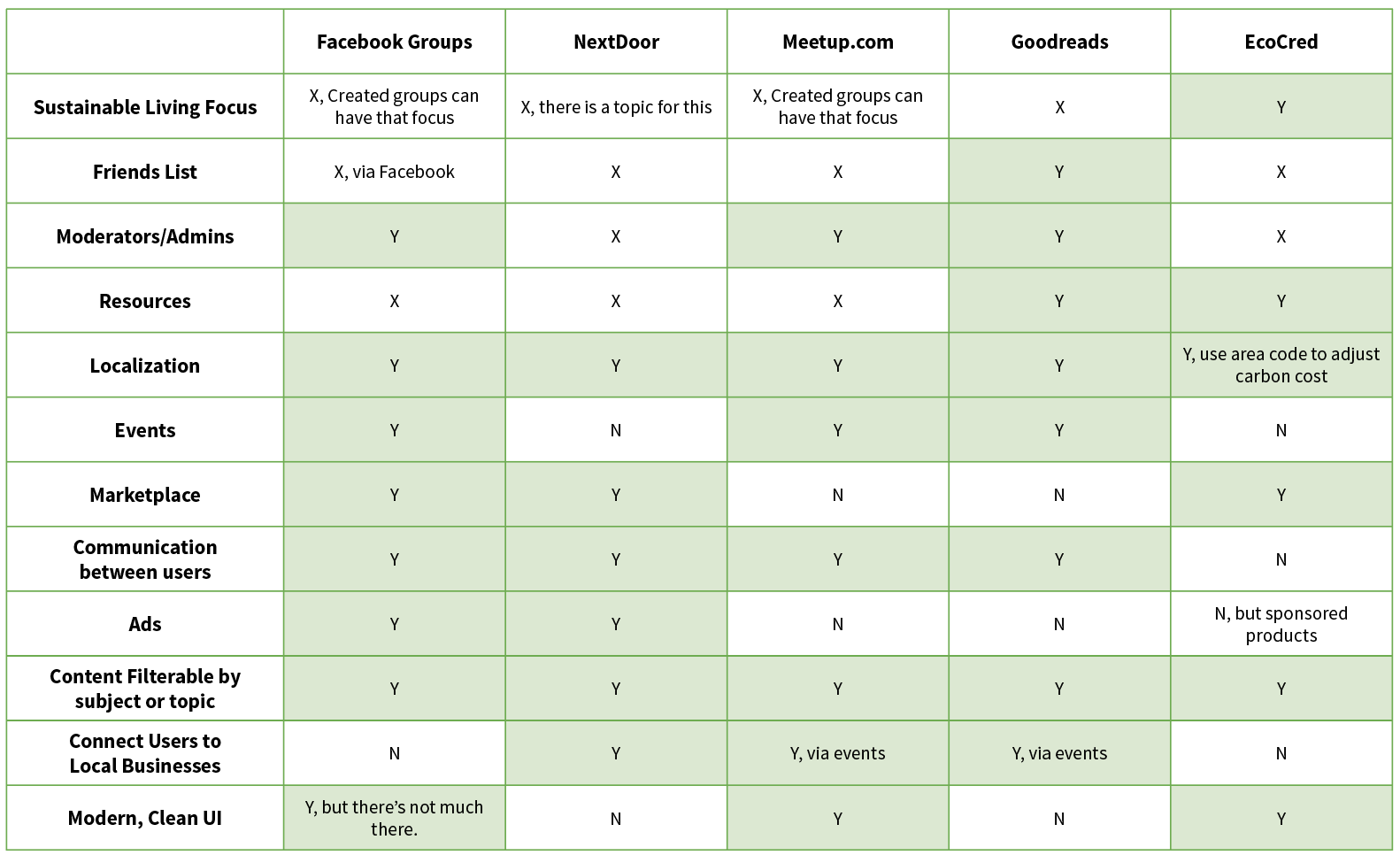
Based on my research, I decided on a solution that involved social media (i.e. community building) and a localization feature. I gathered a list of competition and used my research to create a sense of what would be important to my newly created persona.
All of my interviewees were Facebook users and utilized Facebook Groups to get and share information currently. I analyzed how Facebook did things well or not well for a large part of this project.
From there, I generated a list of possible features the app could have and focused in on how users would work through creating new content. This dissection would prove useful upon sketching and wireframe building.
The feature prioritization matrix and card sort helped me organize the features, and also realize that I was focusing on not the most important things, such as events and the more operational aspects of the app.
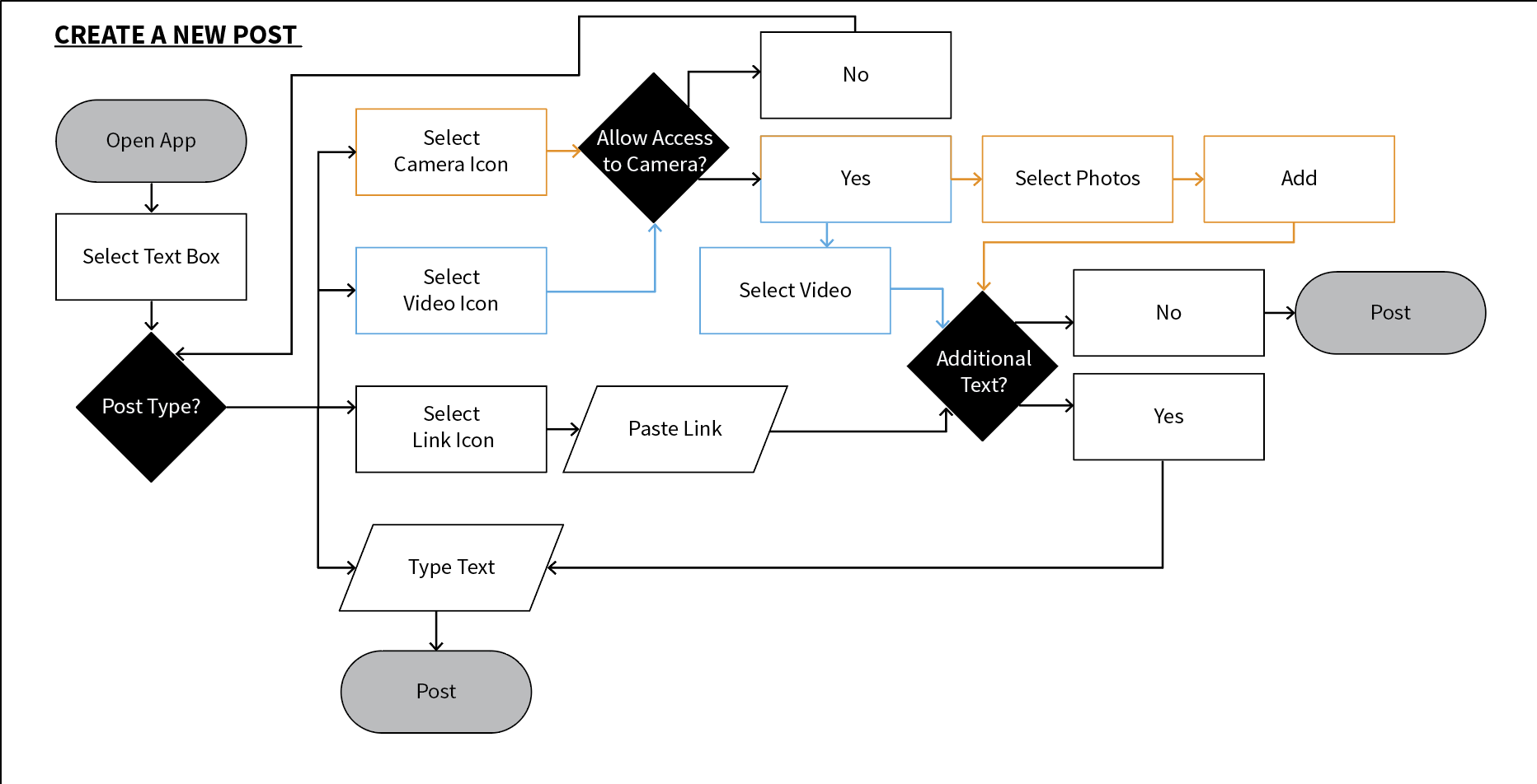
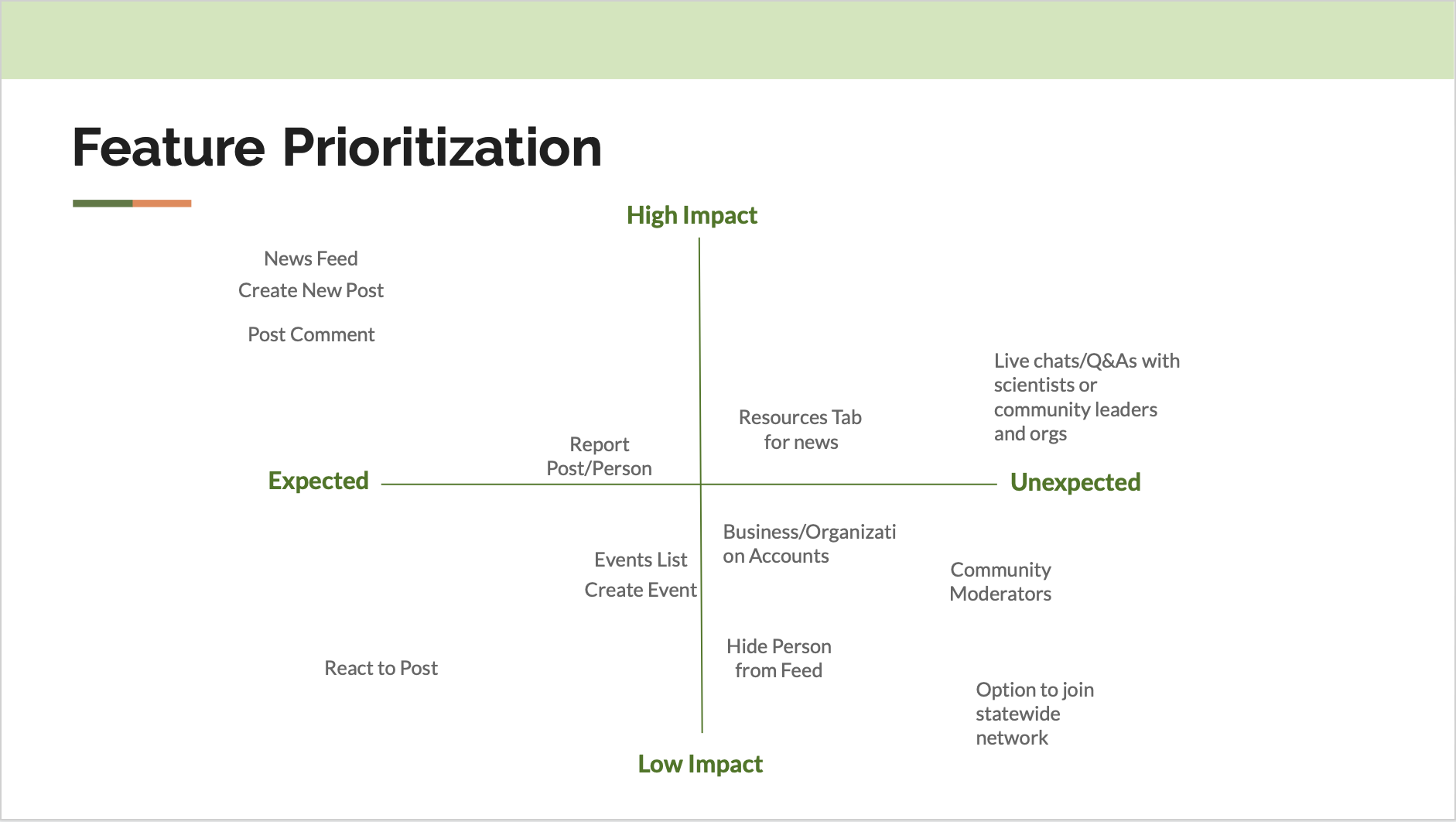
So, I simplified my list for a MVP and added the Favorites feature. On Facebook, the “Save” feature is widely used and adding the feature would allow users to curate their content. This idea comes into play within the prototype later on.
These activities allowed me to refocus and keep the architecture of the app simple, clear, and easy to use. I stuck with a flat architecture of News Feed, Resources, Favorites, and Profile (settings). these main buckets would always be accessible to the user for easy navigation through the app.
Sketches, Wireframes, and Testing
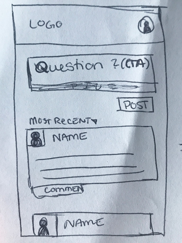
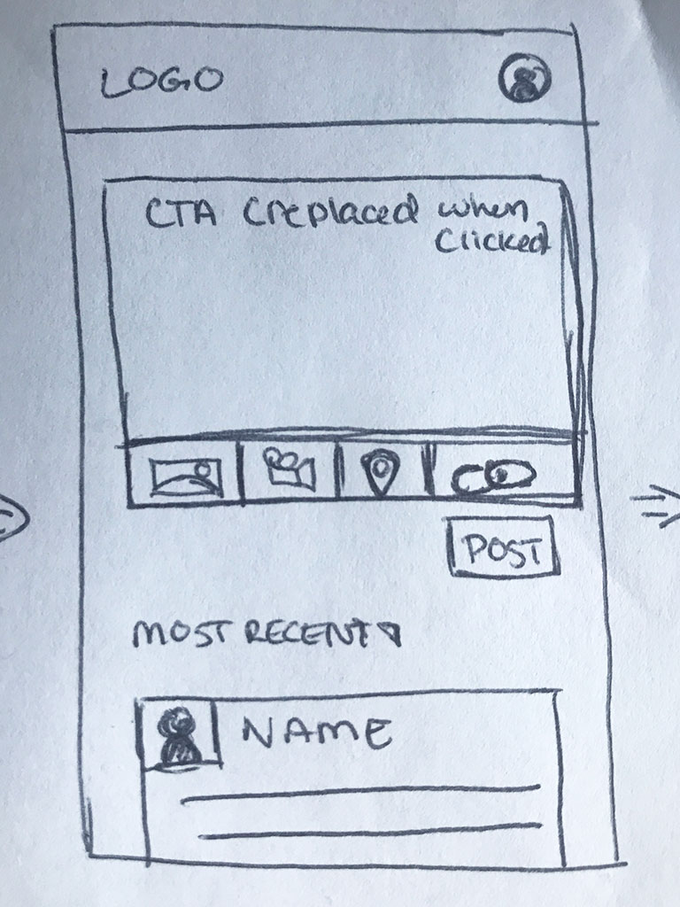
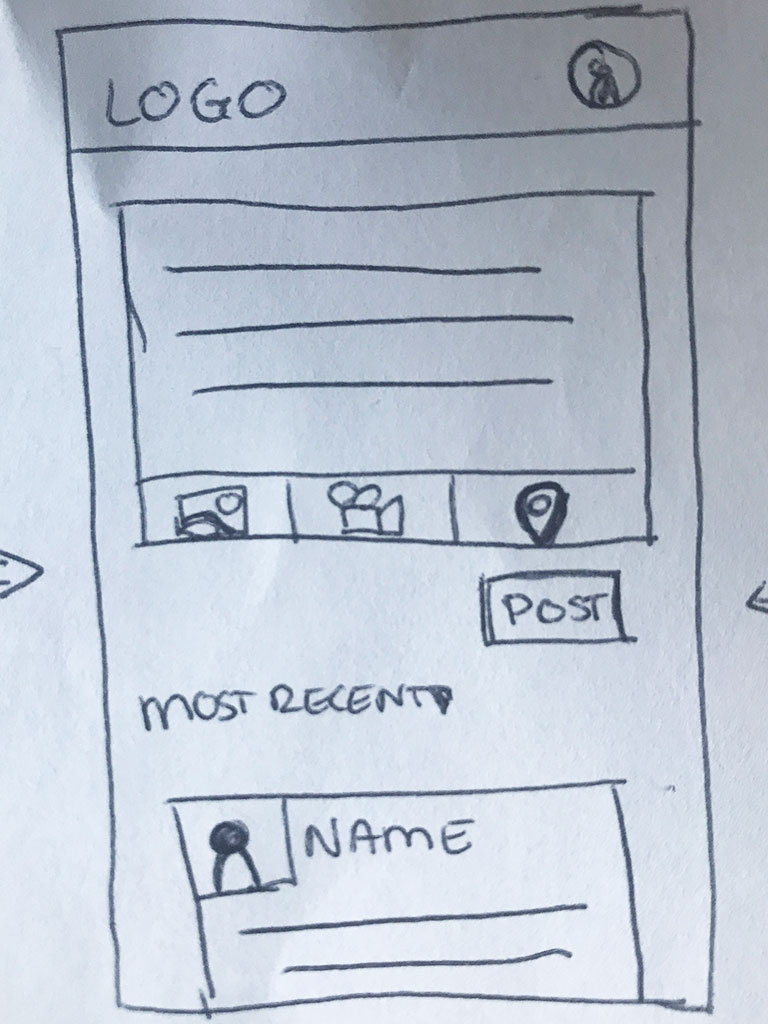
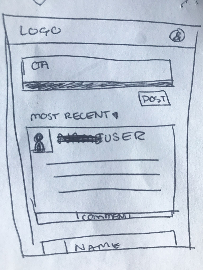
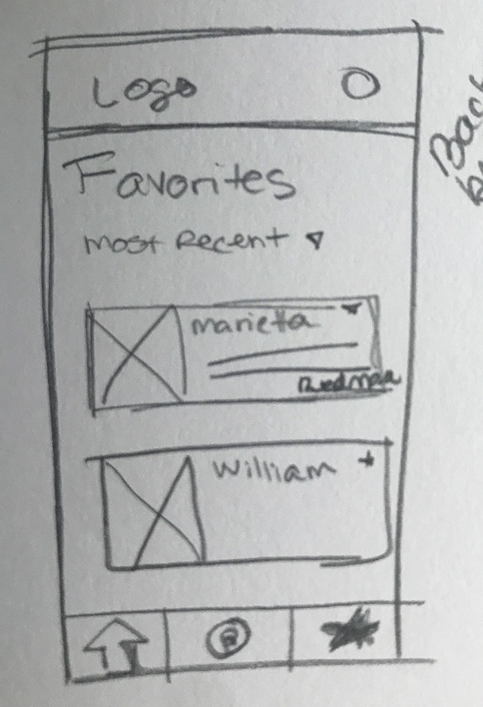
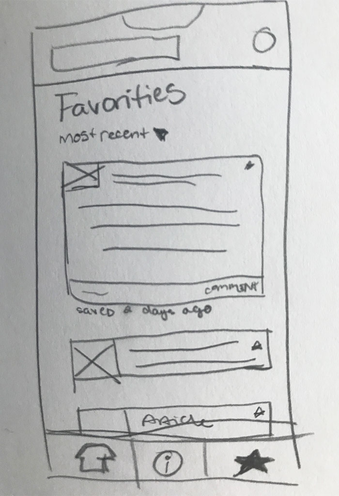
In my sketches, you can see a very basic flow worked out on paper. As I mimicked an often used format for social media, I just needed to test that it was still familiar enough to be used and understood. After positive feedback on functionality, I utilized these to flesh out the more complex aspects of the content creation in the wireframe stages.
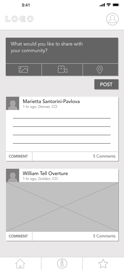
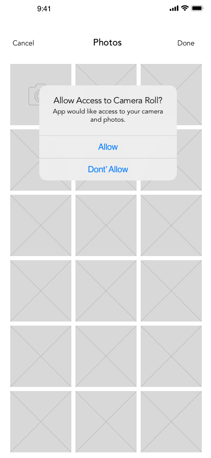
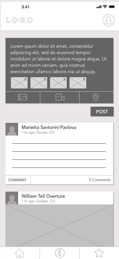
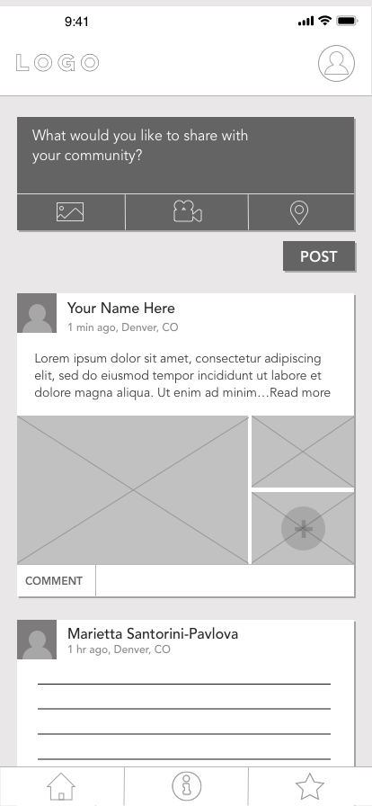
In the wireframe stage, I focused on creating visual hierarchy and went through several stages of changes. I relocated the comment CTA to align with standards, and I focused in on interface states to help guide the user through the experience.
Once I had the wireframes created, I tested it with several users. The feedback brought up aspects for me to further develop and test.
I then created the Favorites feature and sign up process. The localization aspect wasn’t originally present to the user during wireframe tests, and that part of the concept was lost to them unless I explained it.
Prototypes
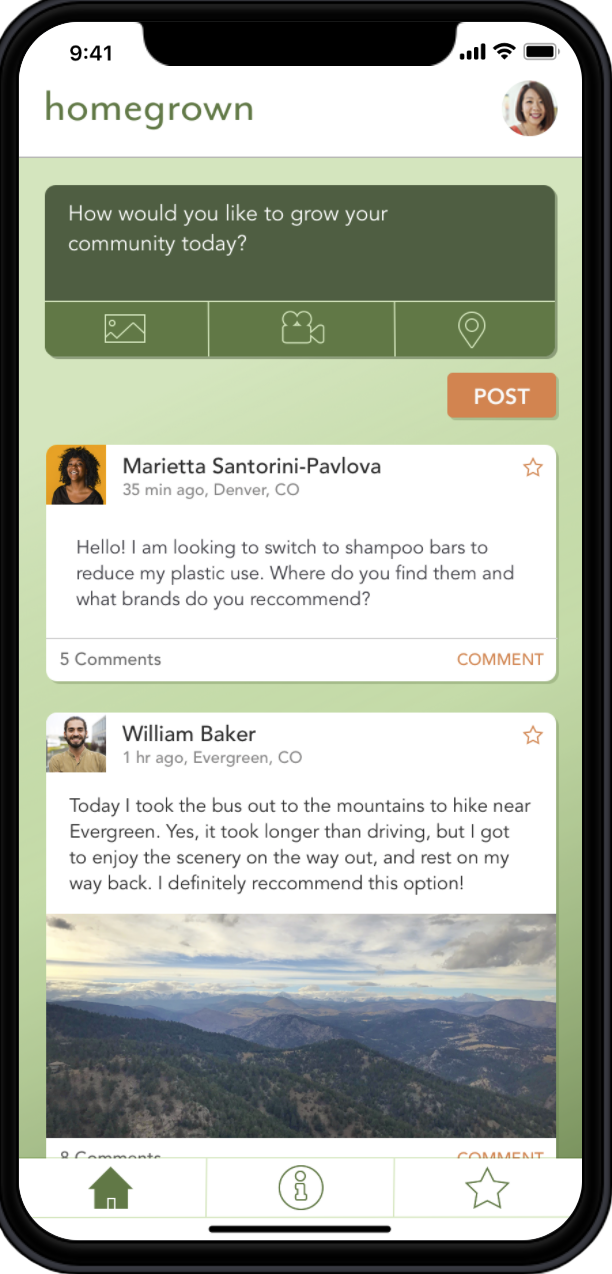
Next, I created a brand and name for the app, keeping in mind locality, community, and sharing. I chose a green main palette as green is associated with nature and it would be recognizable to the user as an eco-focused app. I added the contrasting orange (another common color in nature) to use for buttons, CTAs, and other areas of interaction.
I tested the sign up and favorites features along with my test scenario. I discovered that my scenario was more for a returning user, yet the prototype went through the sign-up process automatically. This caused some confusion.
To fix that, I altered my first screen to be login/sign up and changed the language of the scenario to suit a returning user. I also made some changes to the navigation and hierarchy within the sign up process as well as the Favorites feature. There were a few other details to work out and possibilities to explore in the next steps based upon user feedback.
The main feature to develop next would be the Resources tab. This tab would ideally feature news article from credible sources, as well as a possible live video Q&A sessions with scientists and local organization leaders. This feature needed more research and testing before inclusion in the prototype.
